Poly4 fertiliser brand development
Published March 6, 2023
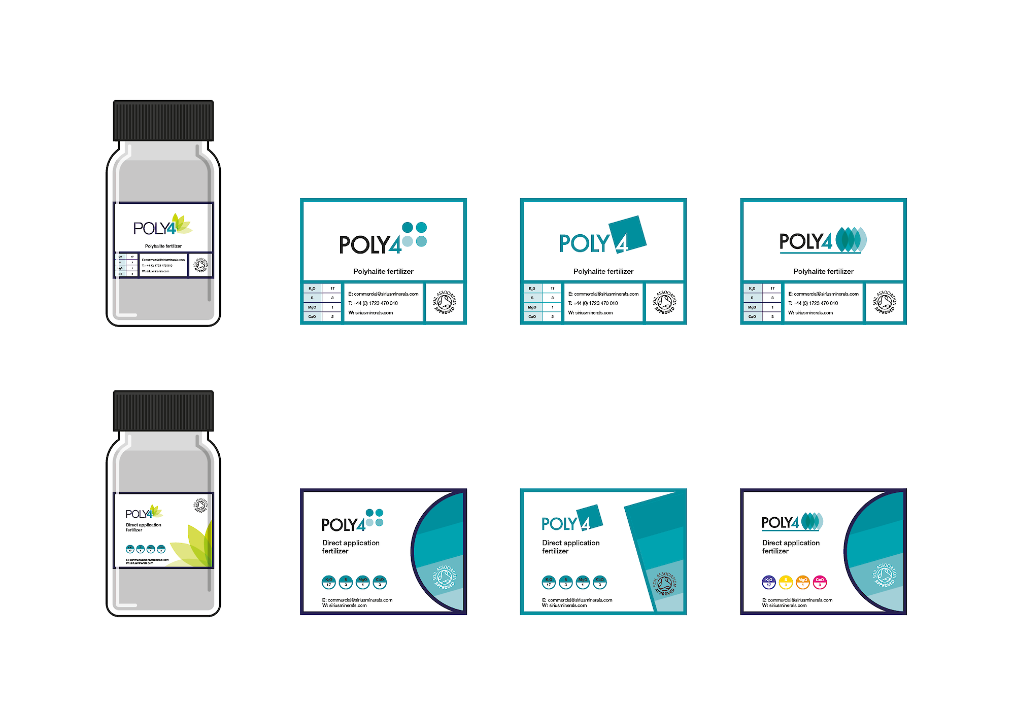
Towards the beginning and end of my previous in-house design role I was heavily involved in developing the branding for the Poly4 family of fertilizer products. The below images are mostly from the latest round, although there is a peek at some of the earliest logo development from the inital branding concepts. The majority of this work went unused, although some elements were retained going forward.
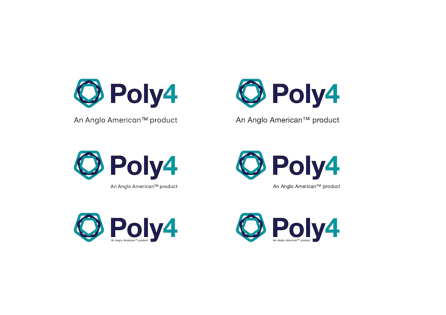
The latest work was all about evolving and softening the logo – changing the text to lowercase and removing the cuts to emphasising the Yorkshire rose mark – while retaining the same brand typeface and colours. There was also lots of exploration around different packaging options to replace the plastic jars previously used to distribute samples at roadshows, etc.
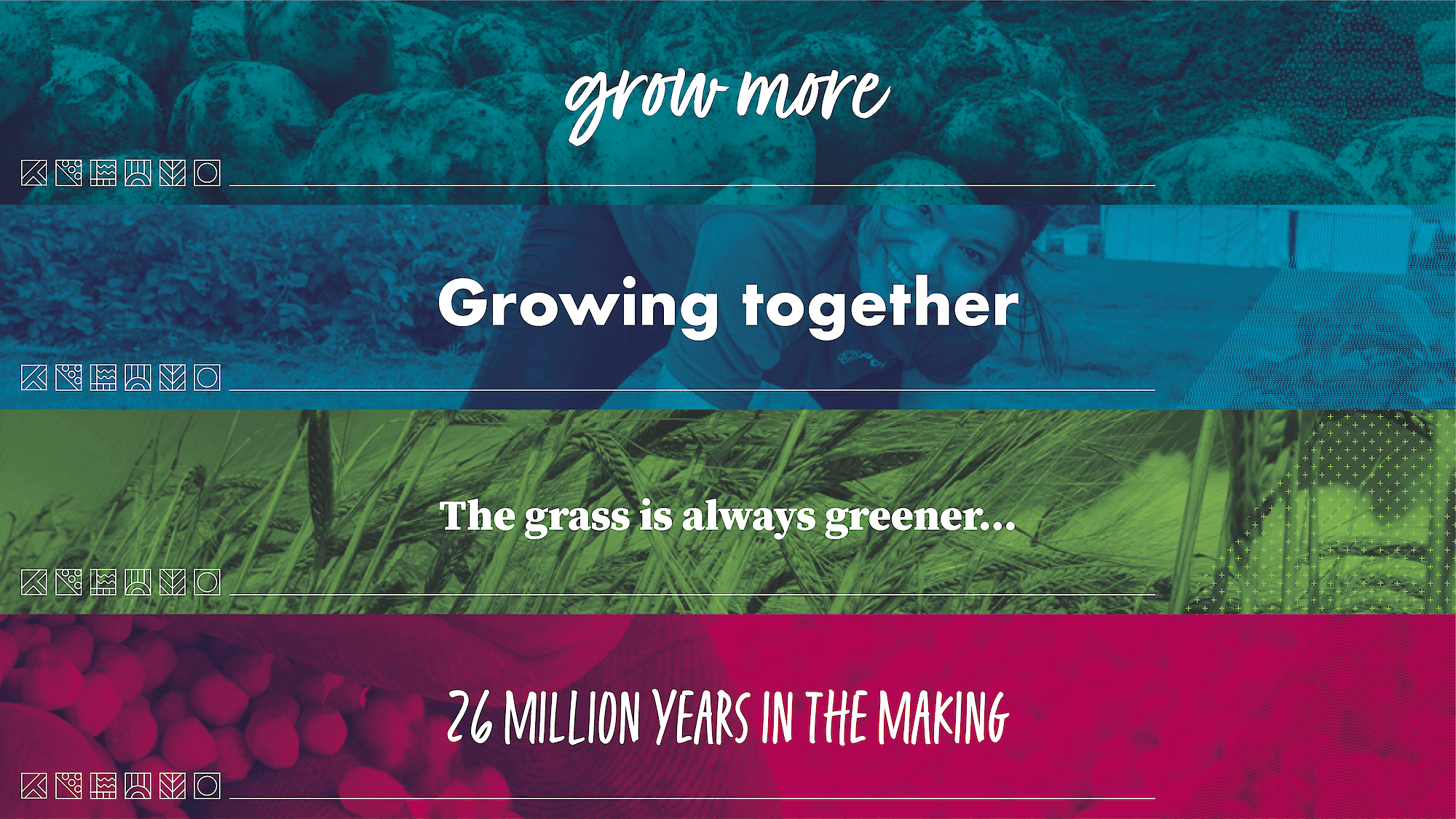
As part of the latest rebrand there was a desire to visually represent the product's journey from mine to plate, so I developed a set of six icons to represent the different stages of the product lifecycle that could be used as a visual device in different applications, depending on the story being told (grow for crop trial data-sheets, etc).
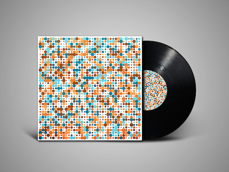
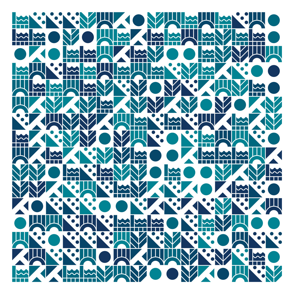
Additionally, I created a Processing program to make randomised patterns from the icons and different product colour palettes so they could also be used as texture or decoration.
I'd also worked on a previous redesign project during the product's original development. As the brief was fairly open I was able to explore various different options, and although much of this work also went unused, one thing that was kept and carried over into the chosen slution was the green colour that is still in use today.