Woodsmith Foundation rebrand
Published January 23, 2024
After several years without much love or attention, it was decided that the Sirius Minerals Foundation was going to change its name to the Woodsmith Foundation, to better align with the parent project of the same name. As part of the renaming process a full rebrand was required.
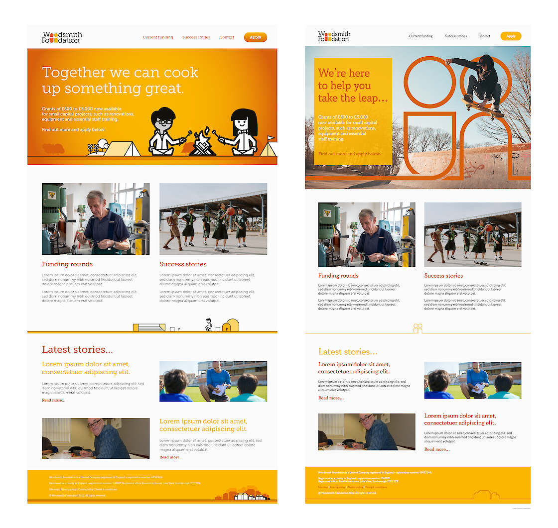
A couple of different concepts were worked on and suggested. This concept took as its central theme the idea that, for the Foundation, "people are at the centre of everything we do". In this case, quite literally, putting people in the centre of the main logotype.
Ultimately, a different design and concept was chosen as the final approach.
Initial thinking was to avoid any overtly illustrative approach, to instead focus on photographs of the real people affected by the Foundation's work. However, research revealed that similar charities and other funding bodies working in the same areas all followed a very similar, photography-led approach, leading to a reassessment of the original thinking.
Using an existing illustration created as an end-of-year round-up of funding activity as the starting point, it was decided a bold, graphic, illustration-led approach could be a useful point of differentiation. Illustrations could be used on bold, flat, graphic backgrounds, or overlaid on photographic backgrounds showing real life locations within the Foundations area of interest.
The ability to customise the figures within the logotype to create versions for use in specific situations/by specific projects was also explored, but quickly abandoned.

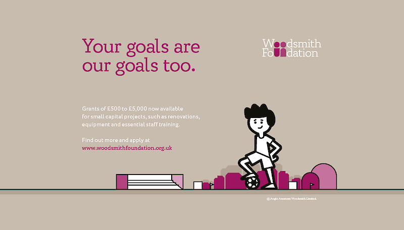

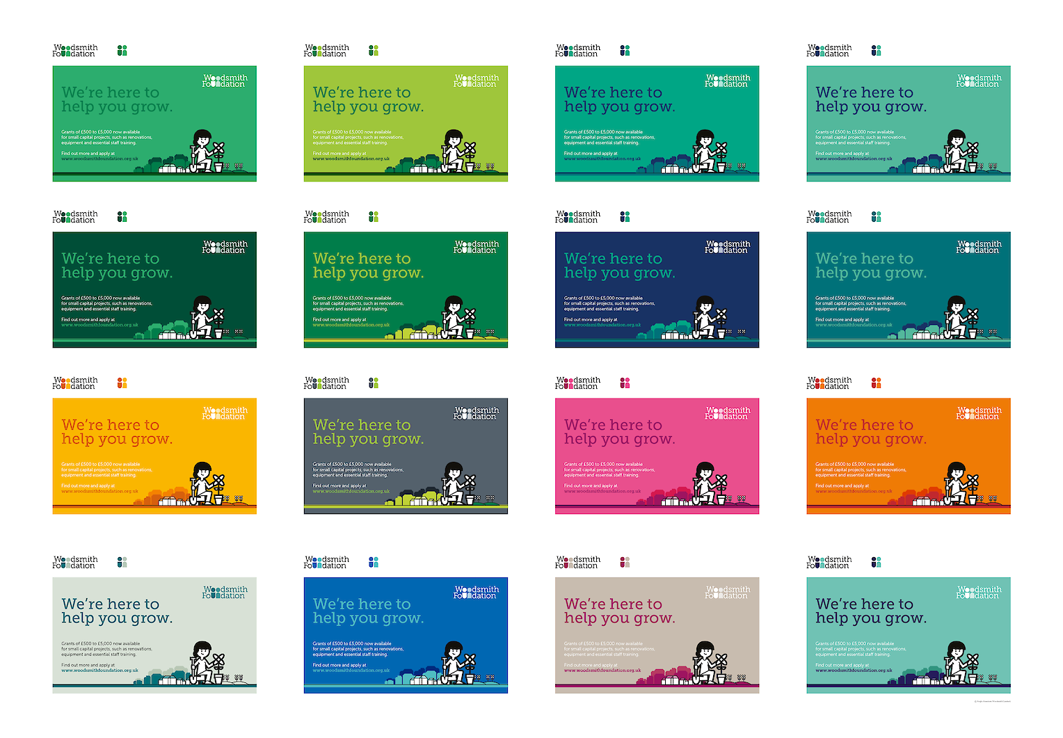
A lot of time was spent looking at different colour palettes, whether we should carry over any of the old Foundation branding, whether it should tie in to the parent companies colour scheme, or be it's own new, entirely separate entity.
A couple of different colour versions were presented, with the preferred option being a new, bright and optimistic orange/yellow palette (as shown on the majority of the examples on this page) – a bold change from the purple/green of the original foundation branding, and the blue/white/red of the corporate colour.

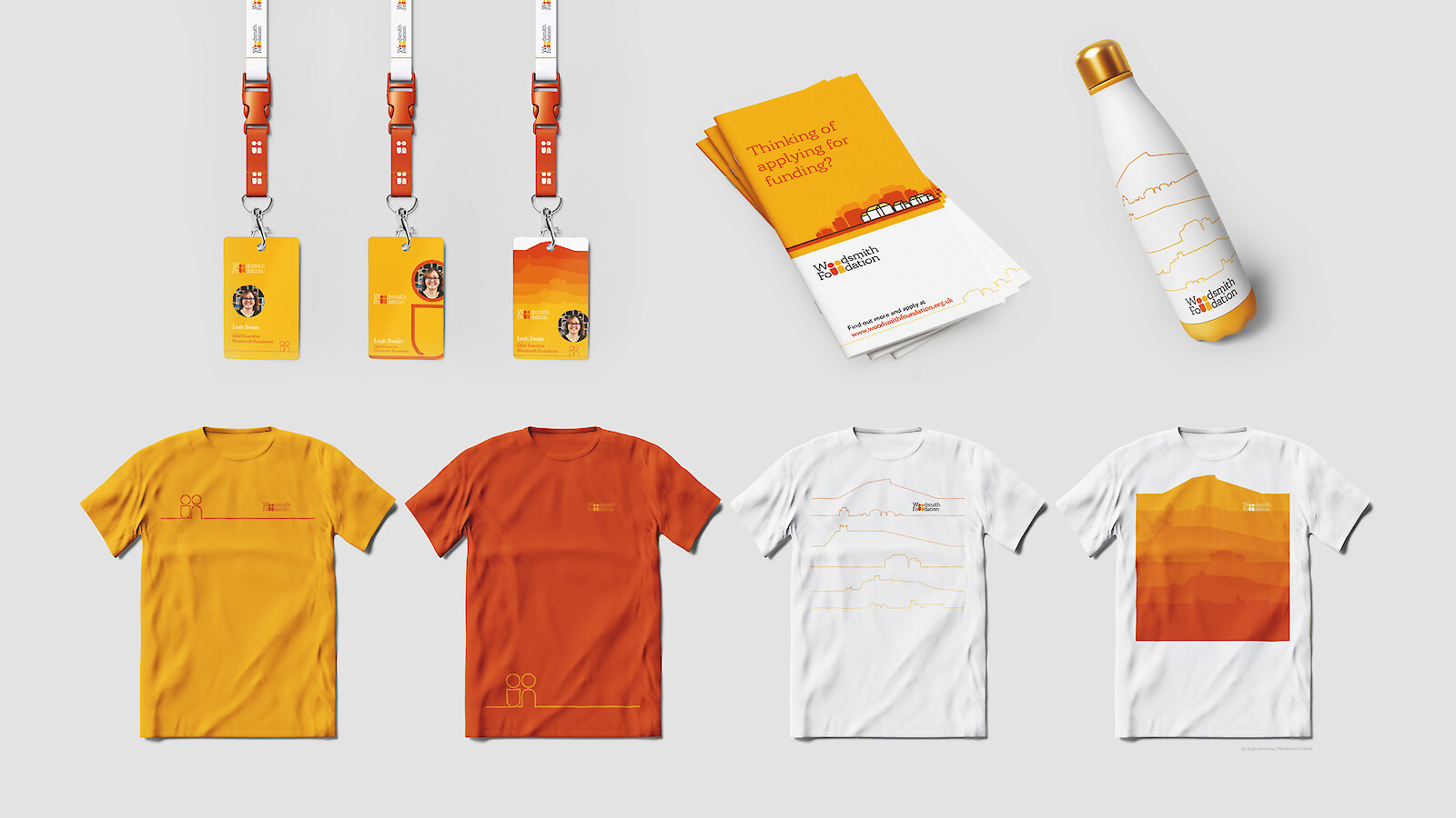
Following further feedback from the various stakeholders, it became clear that the photography-led approach was preferred, and so an alternative approach to integrating the branding with photography was developed.